My work sits at the intersection of instructional design and user experience.
Whether I'm designing a certification course, a mobile app, a print catalog, or a coded website, the process is the same: understand the user, define the goal, design for how people actually think and behave, and measure whether it works.
Below you'll find work across four disciplines: Learning Design, UX Design, Visual & Graphic Design, and Web Design & Development. Each project is grounded in the same design thinking: human-centered, purposeful, and production-ready.
LEARNING DESIGN
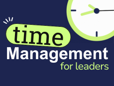
Time Management for Leaders
This partial preview showcases advanced Articulate Storyline development, custom JavaScript, and instructional design grounded in transfer research. Every interaction is designed around what happens after the course ends, not just what happens during it.
JavaScript powers five key interactions: a task flow activity, an interactive calendar planning activity, a self-assessment with a tailored results page that identifies where each learner needs additional practice, and weekly and monthly action plans with print capability. The course completion page delivers three downloadable PDFs for ongoing planning beyond the training.
Every design decision traces back to one goal: behavior change, not course completion.
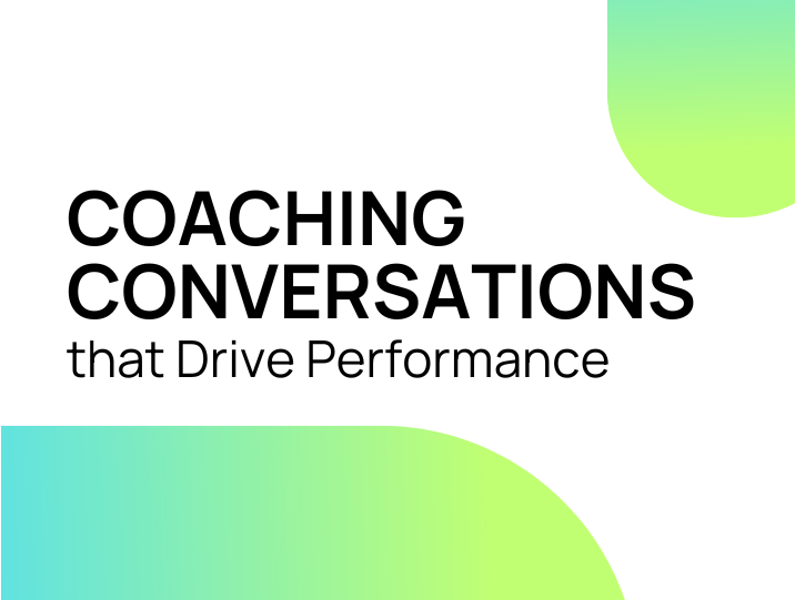
Coaching Conversations
Effective coaching doesn't happen by accident. It’s a skill that requires practice, structure, and self-awareness. This course builds those skills through scenario-based learning that places leaders inside real coaching conversations, requiring them to make decisions, respond to pushback, and adjust their approach based on outcomes.
Branching scenarios reflect the complexity of actual 1:1 conversations, with consequences that reinforce the cost of avoidance and the impact of well-timed feedback. Designed for frontline and mid-level leaders navigating performance gaps, engagement challenges, and team development.
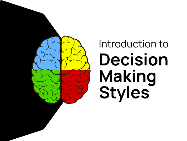
Intro to Decision-Making Styles
How people make decisions is rarely visible until it causes friction. This course makes decision-making styles explicit, giving learners a framework to recognize their own default approach and adapt when working with others who think differently.
Interactive assessments and application activities move learners beyond awareness into practice, building the cross-functional communication and collaboration skills that teams need to make faster, better decisions together.
UX DESIGN
These projects demonstrate my UX design process from user research and personas through wireframing, high-fidelity prototyping, accessibility compliance, and interaction design. Each project started with a real problem and ended with a tested, functional solution.
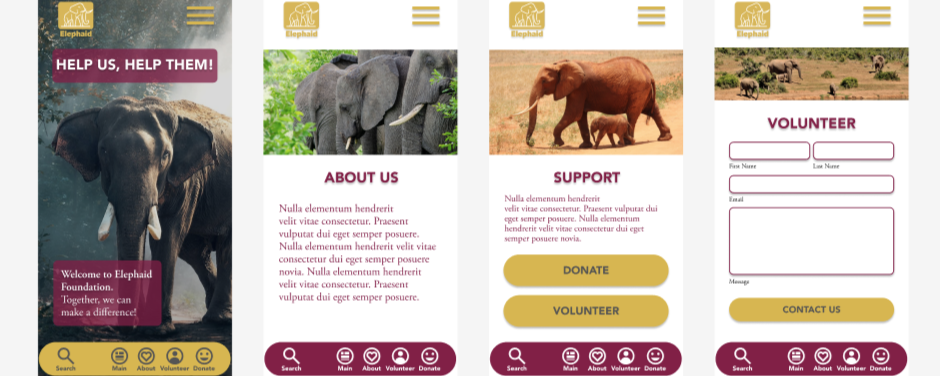
Elephaid Foundation — Mobile App UX Redesign
The Elephaid Foundation had high content engagement but critically low donation conversion. Functionality testing with real users revealed why: broken navigation, missing submit buttons, ambiguous CTAs, and poor color contrast. I redesigned the app from the ground up to address all identified failures, resulting in a complete five-screen prototype with streamlined donation and volunteer flows, a full payment form with a frequency selector, WCAG 2.1 AA accessibility compliance, and documented confirmation states throughout.

Metropolis Capital Bank — Wireframe to High-Fidelity Prototype
A complete mobile banking app prototype built from the client brief through wireframe to high-fidelity design, implemented from a provided brand style guide. Covers Login, Dashboard, Services, and Support screens with full navigation, a component library documenting all button and form interaction states, colorblind-safe form feedback, and WCAG-compliant color contrast throughout.
VISUAL & GRAPHIC DESIGN
These projects reflect my work in print and digital graphic design built in Adobe InDesign and Photoshop, designed with clear hierarchy and purposeful composition, and prepared to professional production standards, including CMYK color, bleed, preflight, and print imposition.
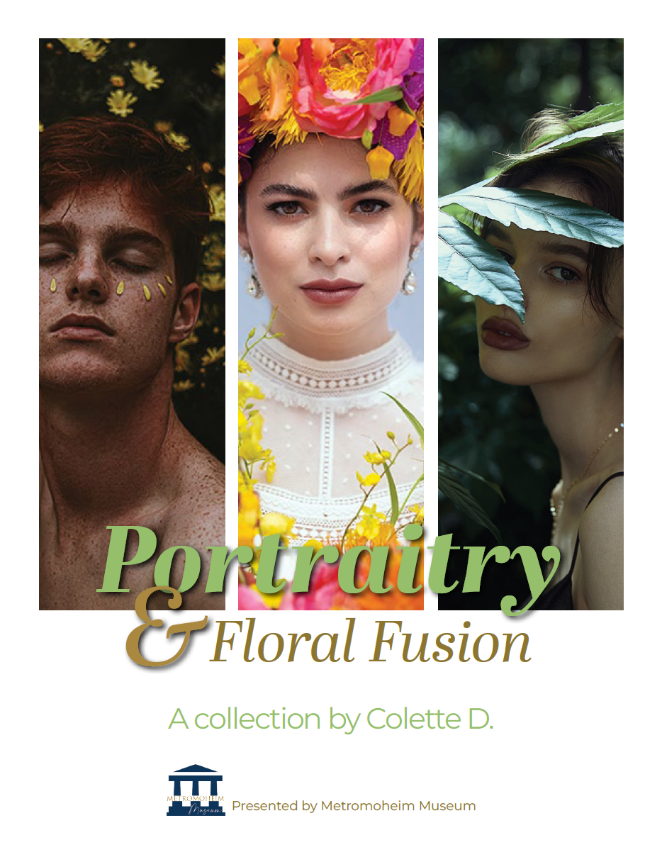
Portraitry & Floral Fusion — Digital Catalog + Print Production
A twelve-page museum catalog designed in Adobe InDesign for both digital distribution and physical print, two very different technical pipelines from a single source file. The digital version was built on a structured grid system with a consistent typographic identity across seven artwork spreads. The print version required converting all images to CMYK at 300 ppi, rebuilding text color swatches, applying bleeds, imposing for saddle-stitch binding with creep compensation, and resolving 79 preflight errors before export to a press-ready PDF through Acrobat Distiller.
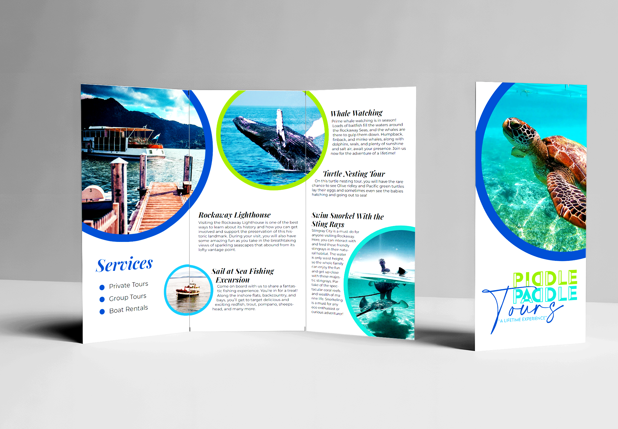
Piddle Paddle Tours — Print Brochure: Trifold Design & Production
A print-ready trifold brochure designed in Adobe InDesign for a coastal tour company, covering five services across six panels with a consistent circular image treatment, two-level typographic hierarchy, and a brand palette applied throughout. Designed for physical distribution with panel width compensation for proper folding, content cleared from fold lines, and reader/printer spreads managed separately for client presentation and production.
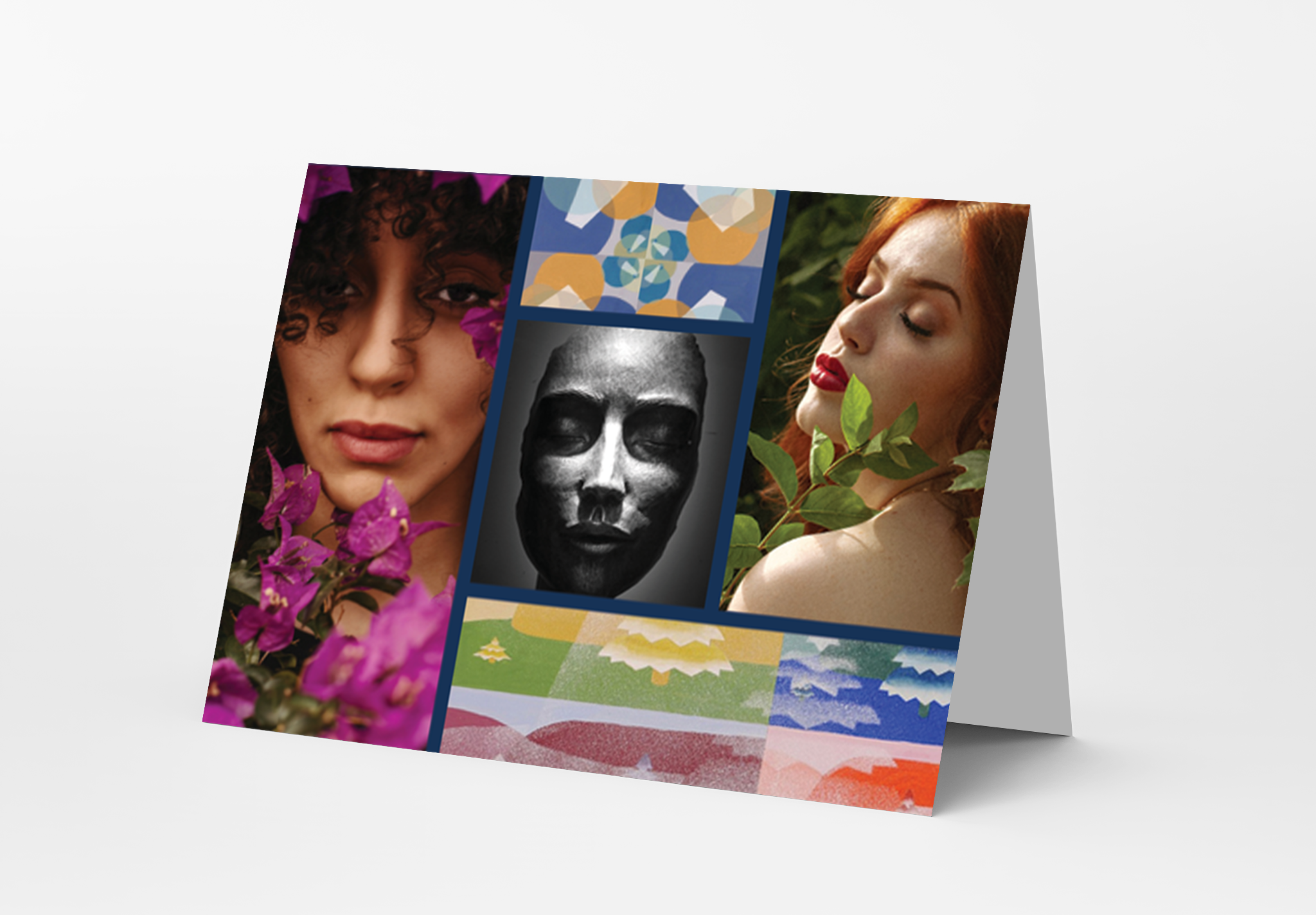
Metromoheim Museum New Year Greeting Card — Print Production
A half-fold greeting card designed in Adobe InDesign for the Metromoheim Museum, built to professional print standards: 0.125" bleed, CMYK color mode, 300 ppi images, fold line planning, and a full preflight process. After preflight flagged three assets, including the museum logo as RGB at 72 dpi, all were corrected in Photoshop and relinked — final preflight confirmed zero errors before print.
WEB DESIGN & DEVELOPMENT
These projects are fully coded, responsive websites. Each was built in HTML5 and CSS3 using Bootstrap 5, validated through the W3C HTML Validator with zero errors, and designed from a brand system applied precisely in code.
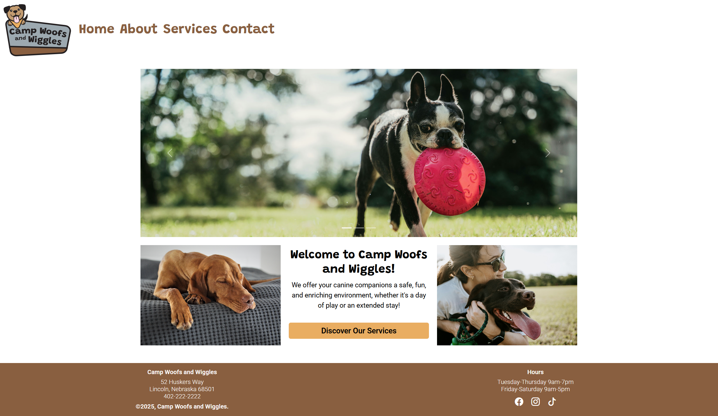
Camp Woofs and Wiggles — Brand + UX + Website
A complete brand-to-browser project: custom logo and brand style guide (color palette, typography, photography guidelines, logo usage rules), mobile and desktop wireframes for all four pages, then a fully coded responsive website in HTML5, CSS3, and Bootstrap 5. The site includes an image carousel with accessibility labels, a three-column homepage layout, a structured Services page with pricing details, a labeled contact form, and a consistent, branded footer with social links, all W3C-validated with zero errors.
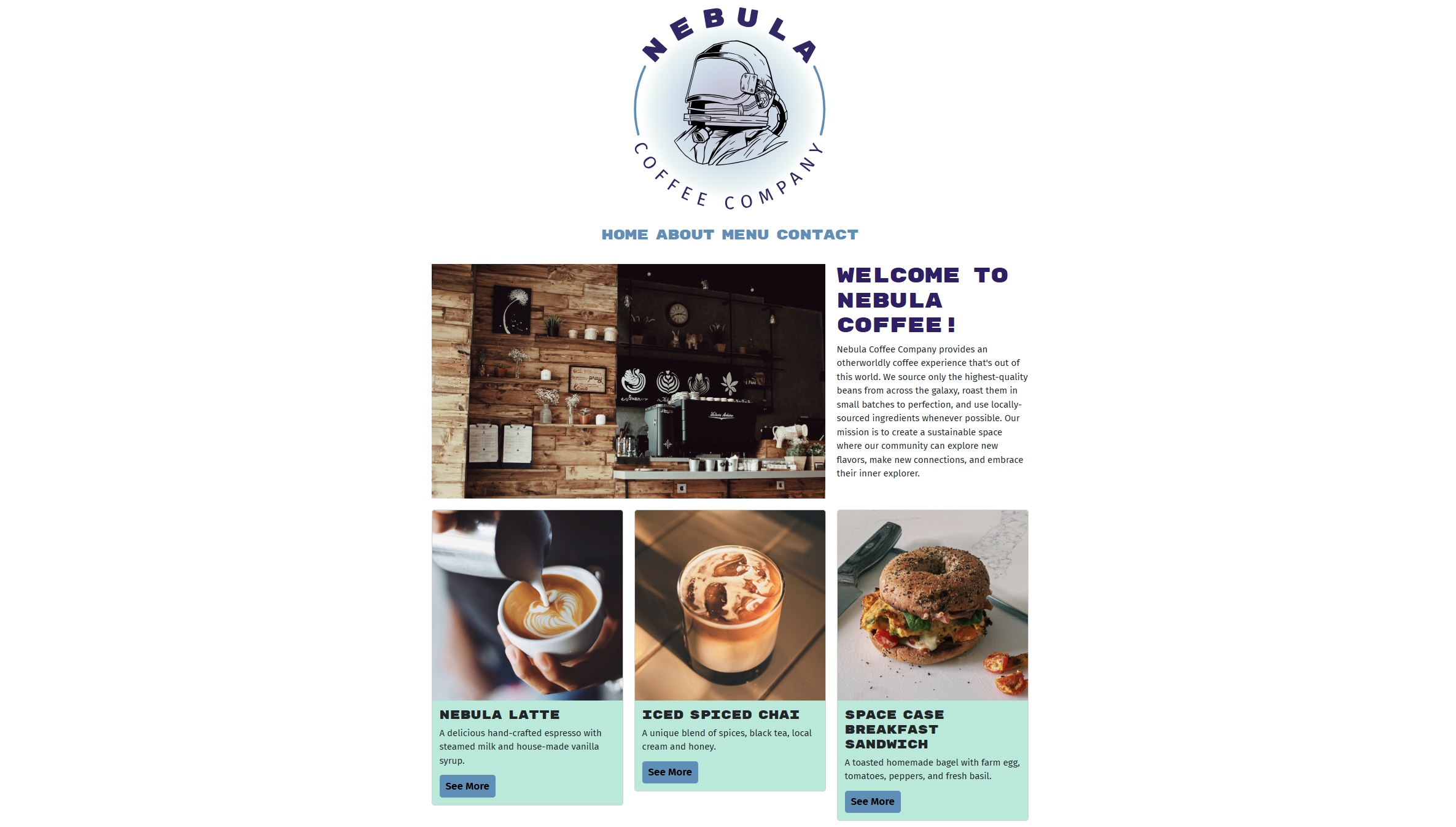
Nebula Coffee Company — Responsive Website
A four-page responsive website coded from a provided brand style guide: Rubik Mono One and Fira Sans typography, a five-color cosmic palette, and Bootstrap 5 for layout. Beyond development, the project required a full WCAG accessibility and SEO audit: descriptive alt text, corrected heading hierarchy across all pages, improved button contrast, keyword-researched meta descriptions, SEO-optimized page titles, and standardized image filenames. All pages W3C validated.